
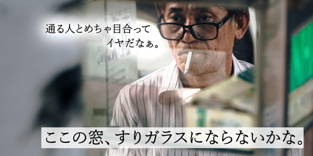
特定エリアだけ背景がぼやけて表示されるCSSについてのご紹介です。
「backdrop-filter: blur(12px)」を使えば特定エリアの背景のみをぼかす(blur)させることができます。
でも2021年3月現在、ブラウザの対応状況があんまりよくない!
Can I Use | backdrop-filter
「ie11」は仕方ないにしても「FireFox」…対応して欲しいよ。
スマホのおかげで「Safari」と「Chrome」のシェアがすごいから、主にこの2つのブラウザに対応して、それ以外(「FireFox」「EDGE」「Opera」「ie11」)は見えれば良いかなぁくらいでOKとして、CSSを書いてみます!
下記のCSSでiOS風のすりガラスエフェクトを「Safari」と「Chrome」に表示して、対応していないブラウザと「ie11」は背景色を濃くして対応します!
CSS
.filter {
  -webkit-backdrop-filter: blur(30px);
  backdrop-filter: blur(30px);
  background: rgba(255,255,255,.1);
}
//  [ backdrop-filter ] が効かないブラウザへの対応
@supports not (backdrop-filter: blur(30px)) {
  .filterArea {
    background: rgba(255,255,255,.8);
  }
}
// 上の [ @supports ] はie11には効かないので、ie11は個別に対応
@media all and (-ms-high-contrast: none) {
  .filterArea {
    background: rgba(255,255,255,.8);
  }
}
このiOS風すりガラスの表現を使って、iPhoneの上からヒュッと出てくる。。。なんて言うんだろ。ウィジェット?ウィジット?分かんない。その「上からヒュッ!」をデモで作ってみたのでFirefoxやie11でも確認してみてね!
iPhoneの「上からヒュッ!」デモ
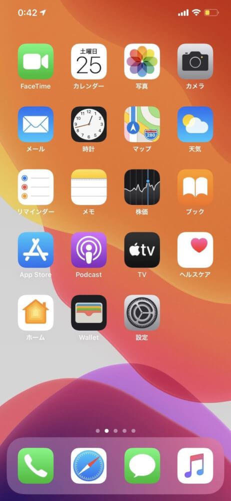
このデモを自分でも実装したい人がもしいてくれたら、下のリンクを押すとiPhoneのスクショ画像をダウンロードできます。
さらに画像と同じ階層にHTMLとCSSのファイルを作ってコピペしたら完成です!
「backdrop-fillter」の勉強にもなるので、よかったらお使いください。
デモの画像ダウンロード
デモのHTML
<div class="demo">
  <img src="ppp.jpg" alt="" />
  <div class="filterArea">
    <ul>
      <li>
        <span></span>
        <span></span>
        <span></span>
        <span></span>
      </li>
      <li></li>
      <li></li>
      <li></li>
      <li><span></span></li>
      <li><span></span></li>
      <li></li>
      <li></li>
      <li></li>
      <li></li>
      <li></li>
      <li></li>
    </ul>
  <span></span>
</div>
</div>
デモのCSS
.demo {
	position: relative;
	width: 100%;
	max-width: 378px;
	margin: 30px auto;
	display: block;
	color: #505050;
	overflow: hidden;
	border: 14px solid #252525;
	border-radius: 45px;
}
.demo::after {
	content: "";
	position: absolute;
	z-index: 100;
	top: 0;
	left: 50%;
	-webkit-transform: translateX(-50%);
	transform: translateX(-50%);
	width: 53%;
	height: 22px;
	display: block;
	border-radius: 0 0 18px 18px;
	background: #252525;
}
.demo > img {
	display: block;
	width: 100%;
}
.filterArea {
	position: absolute;
	z-index: 10;
	top: -100%;
	left: 0;
	-webkit-backdrop-filter: blur(30px);
	backdrop-filter: blur(30px);
	width: 100%;
	height: 100%;
	background: rgba(255,255,255,.1);
	text-align: center;
	-webkit-animation: iphone 1s linear infinite;
	animation: iphone 3s linear infinite;
}
@-webkit-keyframes iphone {
	00% {}
	30% {top: -100%;}
	40% {top: 0%;}
	90% {top: 0%;}
	100% {top: -100%;}
}
@keyframes iphone {
	00% {}
	30% {top: -100%;}
	40% {top: 0%;}
	90% {top: 0%;}
	100% {top: -100%;}
}
.filterArea ul {
	display: block;
	padding: 80px 34px 0;
	letter-spacing: -.4em;
	font-size: 0;
	text-align: left;
}
.filterArea li {
	position: relative;
	letter-spacing: -.4em;
	font-size: 0;
	display: inline-block;
	border-radius: 20px;
	background: rgba(0,0,0,.6);
	vertical-align: top;
	box-shadow: 0 -6px 12px rgba(0,0,0,.05) inset;
	margin-bottom: 12px;
	overflow: hidden;
	text-align: center;
}
.filterArea li:nth-of-type(1) {
	width: 48%;
	margin-right: 4%;
	padding: 14px 0;
}
.filterArea li:nth-of-type(1) span {
	letter-spacing: normal;
	border-radius: 200px;
	width: 54px;
	height: 54px;
	background: #1378fc;
	display: inline-block;
	margin-right: 13px;
}
.filterArea li:nth-of-type(1) span:nth-of-type(1),
.filterArea li:nth-of-type(1) span:nth-of-type(2) {
	margin-bottom: 13px;
}
.filterArea li:nth-of-type(1) span:nth-of-type(2),
.filterArea li:nth-of-type(1) span:nth-of-type(4) {
	margin-right: 0;
}
.filterArea li:nth-of-type(1) span:nth-of-type(1) {
	background: rgba(255,255,255,.3);
}
.filterArea li:nth-of-type(1) span:nth-of-type(2) {
	background: #4ed869;
}
.filterArea li:nth-of-type(2) {
	width: 48%;
	height: 149px;
}
.filterArea li:nth-of-type(3) {
	width: 22%;
	margin-right: 4%;
	height: 66px;
}
.filterArea li:nth-of-type(4) {
	width: 22%;
	margin-right: 4%;
	height: 66px;
}
.filterArea li:nth-of-type(5) {
	width: 22%;
	margin-right: 4%;
	height: 140px;
}
.filterArea li:nth-of-type(6) {
	width: 22%;
	height: 140px;
}
.filterArea li:nth-of-type(5) span, .filterArea li:nth-of-type(6) span {
	position: absolute;
	bottom: 0;
	left: 0;
	width: 100%;
	height: 60%;
	background: rgba(255,255,255,1);
}
.filterArea li:nth-of-type(6) span {
	height: 30%;
}
.filterArea li:nth-of-type(7) {
	width: 48%;
	margin-right: 4%;
	height: 66px;
	margin-top: -76px;
	display: block;
}
.filterArea li:nth-of-type(8), .filterArea li:nth-of-type(9), .filterArea li:nth-of-type(10), .filterArea li:nth-of-type(11), .filterArea li:nth-of-type(12), .filterArea li:nth-of-type(13), .filterArea li:nth-of-type(14), .filterArea li:nth-of-type(15), .filterArea li:nth-of-type(16), .filterArea li:nth-of-type(17) {
	width: 22%;
	margin-right: 4%;
	height: 66px;
}
.filterArea li:nth-of-type(11) {
	margin-right: 0;
}
.filterArea > span {
	position: absolute;
	bottom: 11px;
	left: 50%;
	-webkit-transform: translateX(-50%);
	transform: translateX(-50%);
	display: block;
	width: 140px;
	height: 5px;
	border-radius: 12px;
	background: rgba(255,255,255,.5);
}
@supports not (backdrop-filter: blur(30px)) {
	.filterArea {
		background: rgba(255,255,255,.8);
	}
	.filterArea > span {
		background: rgba(0,0,0,.4);
	}
}
@media all and (-ms-high-contrast: none) {
	.filterArea {
		background: rgba(255,255,255,.8);
	}
	.filterArea > span {
		background: rgba(0,0,0,.4);
	}
}


コメント